Maps, maps, maps
I just completed Datacamp course Spatial Analysis in R with sf and raster1 and wanted to use this to see some South Carolina data. This post is exploring different ways of making maps using the census data.
Thanks to Tidycensus2, and sf3, this is a lot easier than it to do than it used to be.
I started with the basic tidycensus example. I already had a Census API key, but need to set some options to make tidycensus return data in sf form.
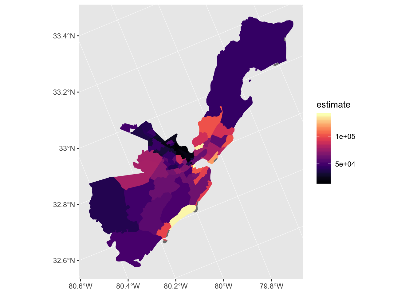
I fetched the data for Charleston County and plotted using ggplot
options(tigris_class = "sf")
options(tigris_use_cache = TRUE)

#median household income
chs <- get_acs(state = "SC",
               county = "Charleston",
               geography = "tract",
               variables = "B19013_001",
               geometry = TRUE)
## Getting data from the 2012-2016 5-year ACSchs %>%
ggplot(aes(fill = estimate, color=estimate)) +
geom_sf() +
coord_sf(crs = 26911) +
scale_fill_viridis(option = "magma") +
scale_color_viridis(option = "magma")
At first glance, the map looked great but as I examined it, I had a hard time interpreting it. The legend was confusing with the exponential notation and generally a dark color represents a higher value. The bright splash of yellow on the coast clearly stood out (Kiawah Island). I recalled from using choroplethr4 and the choroplethr training5 that one of the things choroplethr does is divide the values into groups, to make it easier to compare the values.
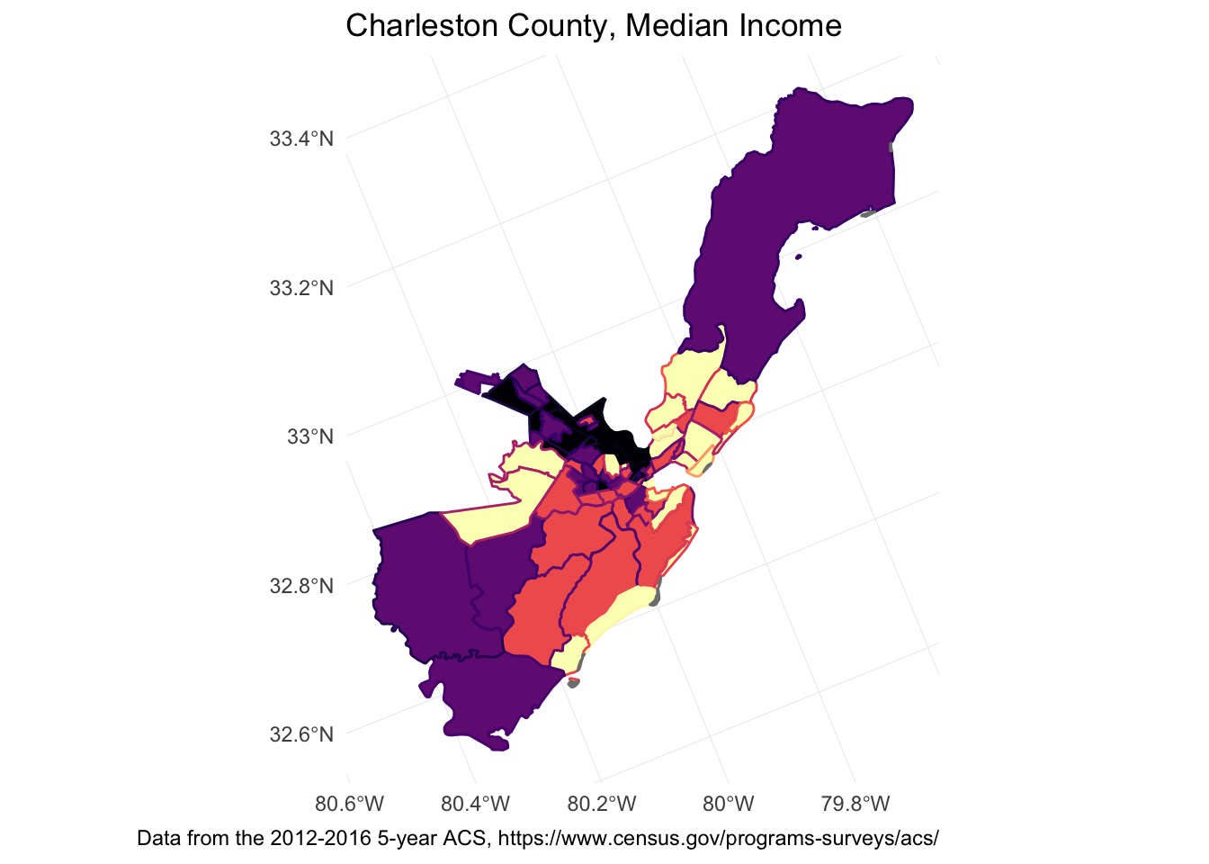
range(chs$estimate, na.rm = TRUE)## [1] 17015 139148chs <- chs %>% mutate(nt = ntile(estimate,4))I remapped it, and kept the border with original value. Now all the beach areas are in the highest level, and it’s clear that the North Charleston area clearly has the lowest median incomes. The legends are still bad, so I removed them, added a title and a caption with the source of the data. Pretty good for a few lines of code.
caption_str <- "Data from the 2012-2016 5-year ACS, https://www.census.gov/programs-surveys/acs/"
chs %>%
  ggplot(aes(fill = nt, color=estimate)) +
  theme_minimal() +
  geom_sf(show.legend = FALSE) +
  coord_sf(crs = 26911) +
  scale_fill_viridis(option = "magma") +
  scale_color_viridis(option = "magma") +
  ggtitle("Charleston County, Median Income") +
  labs(caption = caption_str)
tmap example
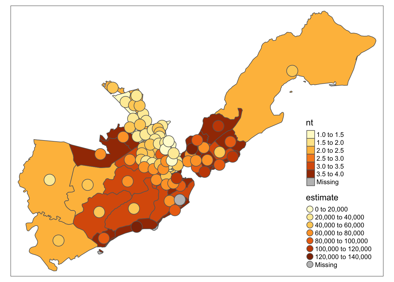
The areas are filled with the tiled values, and put bubbles to represent the original estimates (to see the difference between the two). tmap uses a darker color for higher values by default, which is nice.
tm_shape(chs) +
  tm_polygons(col="nt") +
  tm_bubbles(col = "estimate")
leaflet example
Using the informative blog post by Julia Silge6, I copied the example to South Carolina. Her example customizes the palette based on the data. Awesome! Now the data can be mapped as is. You can even click on a census tract and get data about it.
pal <- colorQuantile(palette = "viridis", domain = chs$estimate, n = 10)

chs %>%
    st_transform(crs = "+init=epsg:4326") %>%
    leaflet(width = "100%") %>%
    addProviderTiles(provider = "CartoDB.Positron") %>%
    addPolygons(popup = ~ str_c("Median income: ",
                                estimate, " GEOID:", str_extract(GEOID, "^([^,]*)")),
                stroke = FALSE,
                smoothFactor = 0,
                fillOpacity = 0.7,
                color = ~ pal(estimate)) %>%
    addLegend("bottomright",
              pal = pal,
              values = ~ estimate,
              title = "Median Income",
              opacity = 1)
All of South Carolina
sc_median <- get_acs(state = "SC", geography = "tract",
                  variables = "B19013_001", geometry = TRUE)
## Getting data from the 2012-2016 5-year ACSsc_pal <- colorQuantile(palette = "viridis", domain = sc_median$estimate, n = 10)
sc_median %>%
st_transform(crs = "+init=epsg:4326") %>%
leaflet(width = "100%") %>%
addProviderTiles(provider = "CartoDB.Positron") %>%
addPolygons(popup = ~ str_c("Median income: ",
estimate, " GEOID:", str_extract(GEOID, "^([^,]*)")),
stroke = FALSE,
smoothFactor = 0,
fillOpacity = 0.7,
color = ~ pal(estimate)) %>%
addLegend("bottomright",
pal = sc_pal,
values = ~ estimate,
title = "Median Income",
opacity = 1)## Warning in pal(estimate): Some values were outside the color scale and will
## be treated as NA
## Warning in pal(estimate): Some values were outside the color scale and will
## be treated as NAhttps://www.datacamp.com/courses/spatial-analysis-in-r-with-sf-and-raster↩
choroplethr R package, https://cran.r-project.org/web/packages/choroplethr/index.html↩
Ari Lamstien, Choroplethr package (https://arilamstein.com/open-source/)↩
Using tidycensus and leaflet to map census data, https://juliasilge.com/blog/using-tidycensus/↩